Your certificate.
Closer to hand.
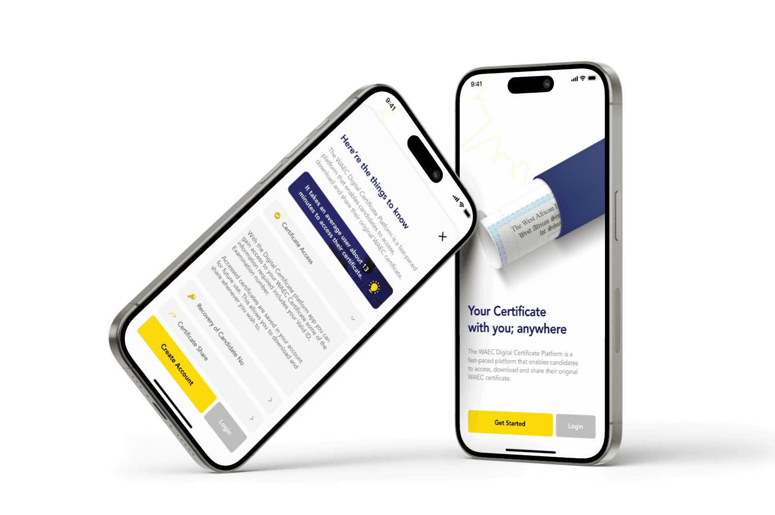
A major project for the West African Examinations Council (WAEC), supporting certificate access across West Africa and sharing with organisations around the world. My focus was bringing that experience to smartphones through a familiar journey and clearer navigation.
- My role
- Product Designer
- Collaboration
- Co-designed with another designer
- My contribution
- Mobile app and web version 2
- Focus
- Access, identity verification and sharing
A closer look at the interface.
Take a 45 second tour of the WAEC Digital Certificate interface. Press play to explore the screens, and pause whenever you want a closer look.
A certificate should be easier to reach.
Candidates of the West African Examinations Council (WAEC) need to access their certificates and share them with universities, employers and other organisations. The existing project addressed the delays and difficulties associated with physical certificates and manual verification.
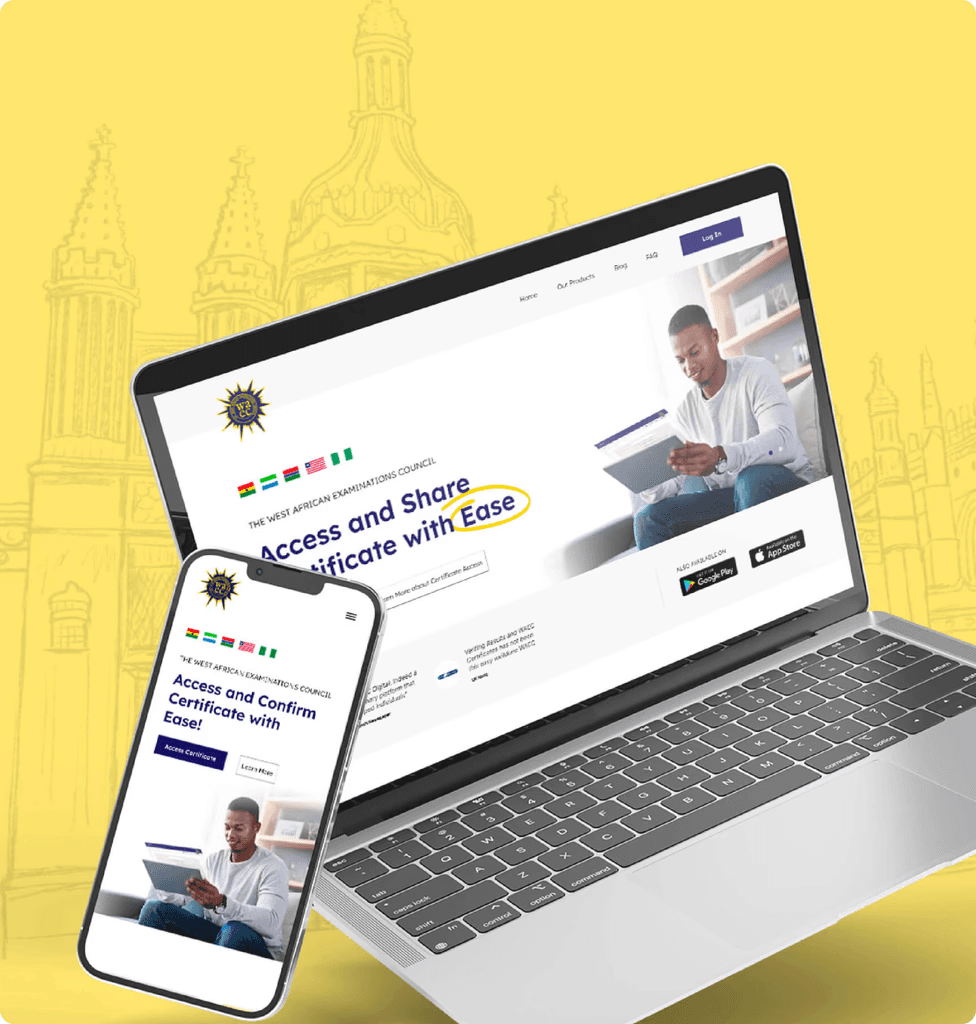
My focus was making this solution more accessible through a smartphone app. I collaborated with another designer on the mobile experience and the second version of the web platform, covering registration, identity verification, certificate access and external sharing.
The problem went beyond a screen.
WAEC stakeholders had already researched the needs of students, universities and certification bodies. Our team supplemented those business and operational insights with interviews to understand people’s experiences in more depth.
Verification took time
Contacting offices and relying on paper documents could slow down educational and professional applications.
Location created friction
Collecting certificates in person was difficult for candidates who had relocated or were studying abroad.
Paper could be lost
Misplaced certificates made it harder for candidates to prove their qualifications when they needed them.
Keep the familiarity.
Improve the clarity.
This was an extension of an existing product. I retained the established journey and brand consistency, then focused improvements on information and navigation.
Preserve the core journey
The app retained the familiar sequence of signing up, verifying identity, accessing a certificate and sharing it. My work adapted that experience for mobile rather than replacing the journey.
Make certificate status clearer
I added information tags to help users understand the status of their certificate. This gave status information a clearer place in the experience.
Bring important actions into view
I made important features easier to find and navigate. The mobile home screen gives certificate access and sharing prominent entry points, alongside exam number retrieval and share history.
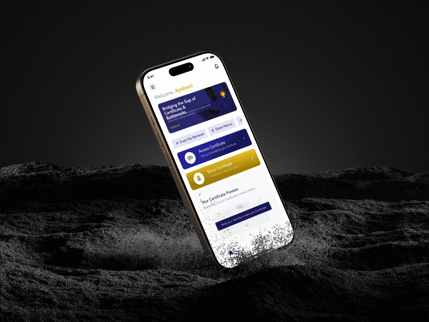
Images are from my existing portfolio presentation.
Not every improvement needs a new journey.
This project shows how I work within an established product: understand what needs to remain familiar, then improve the parts that need clearer information or easier access.
The contribution I can demonstrate here is the design of the mobile experience and improvements to navigation and status visibility.
Back to the room?
There’s more work in the album, and more about me around the house.
Return to the living room ↗Let’s talk ↗